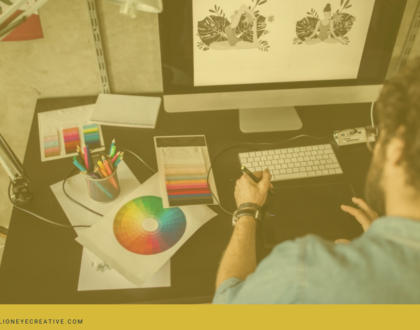
principles of graphic design: typography
Typography is considered one of the most essential and gratifying elements of graphic design. Every design should incorporate typography which means graphic designers need to learn its principles to come up with excellent designs.
Typography and design together help content maximize its potential and enhances its readability of the information you are trying to convey to your audience. The application of typography principles lets graphic designers break up text into blocks and provide visual shortcuts that let audiences sift through masses of information.
What is typography?
Typography is a tool that helps graphic designers create things and shape content — it gives the language a physical form and enables the flow of understanding. Simply, it is the visual component of the written words or a sequence of words. This is the art and technique of arranging texts to make the content readable and appealing to the readers.
What are the principles of typography?
The principles of typography help you present your ideas to your audience and get the most out of each word used. These principles revolve around a central idea which is good communication.
1. Typeface and Font
There are three types of typefaces such as serif, sans-serif, and decorative. It is wise to use a maximum of three fonts in a single design or project because it helps keep your design simple and uncluttered. These typefaces are the visual design of letterforms, while a font refers to how those designs are delivered. In addition, fonts are software that allows designers to weight or style.
2. Hierarchy
Hierarchy helps designers keep their ideas organized so that audiences can always identify which category of information they are looking at and trying to read. On a website, the title of the site is placed at the top of the page in a large header, while the main navigation pages on a website are listed below the header in a smaller font — this is called a visual cue. It helps audiences and readers identify the context of the text without having to think about it. This principle also helps make your text scannable which provides an easier and faster way of finding information.
3. Alignment
Alignment is where the line the text orient towards at — this applies to individual words, a whole body of texts, or even images. It should always stay consistent as possible and every element of a design should be aligned to one of the other elements in some way which creates an equal distance or space between objects.
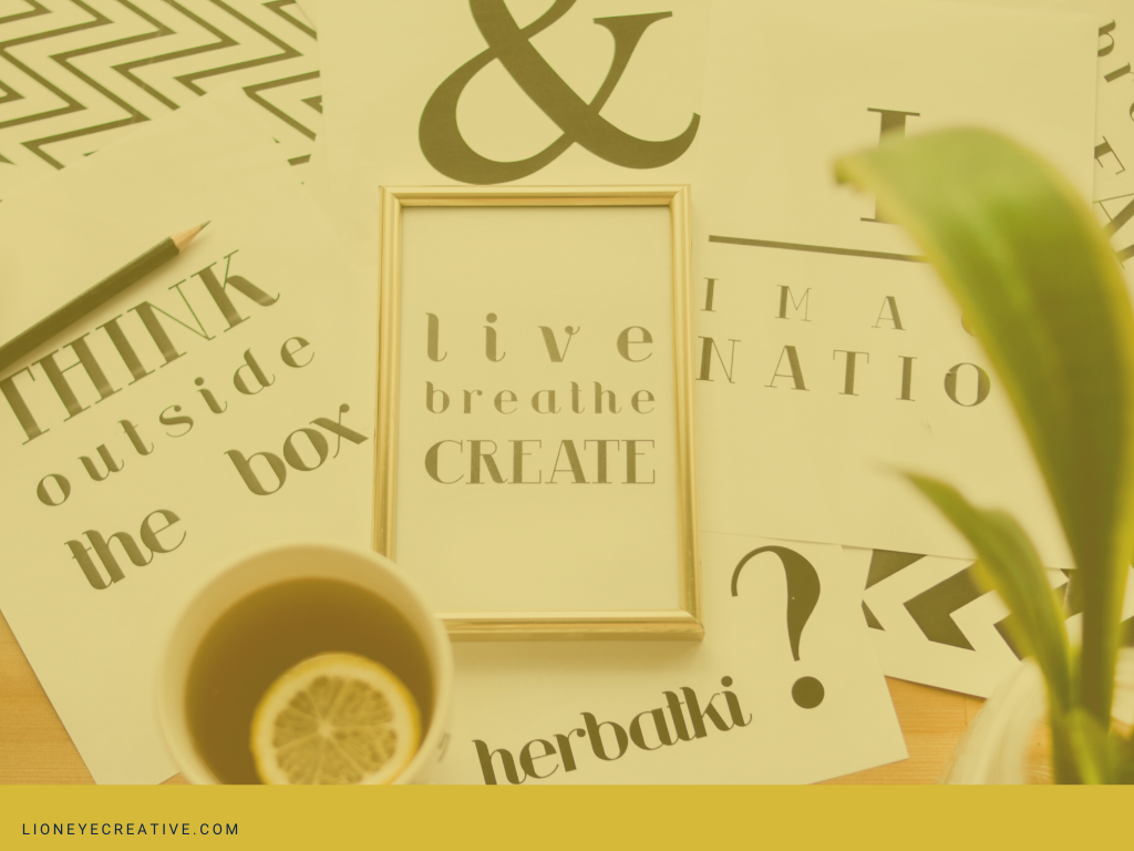
4. Whitespace
Whitespace is the empty space around the text or objects and can take the form of padding, margins, or simply just an uncluttered area in a design. This principle creates a pleasing visual experience for your audience and can even draw their attention to the text. If the text is crammed against each other it makes it difficult for readers to read the content and if a text is given enough breathing room, the design would look stylish and simple.
Most of the time, people would think that flashy colors and bold fonts are the best ways to draw attention to a text or content, but whitespace, on the other hand, can be the best way of drawing your audience in.
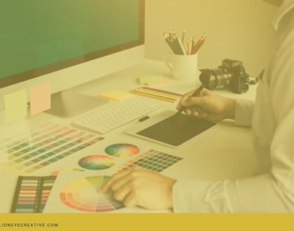
5. Color
Color helps a lot in setting the mood for your design and using the right colors can make your text stand out.
There are three main elements of color:
- Hue – this is the shade of color
- Value – this is the lightness or darkness of the color
- Saturation – this is how brilliant the color is
It is important to ensure that there is a contrast between the three elements in a way that makes your text easy to read. To determine if your design color has excellent contrast, you should view your design in grayscale and if it doesn’t look good you need to tweak its values.
Conclusion
Keep in mind that these principles are meant to guide and help you come up with excellent typography for your graphic design. It is important to keep on learning about the best ways to bring these principles together to form robust and coherent typography.
For more information on the principles of typography, download our Graphic Design ebook.
If you have more questions or are looking for a professional to help you understanf typography in graphic designmore, talk to one of our graphic design specialists now!
Recommended Posts